

Just as DVR busts TV out of its scheduling shackles — “hey, now you can watch any show at any time!” — Racery liberates races from a specific time or location.
In practical terms, our virtual races incorporate miles run (or swum, walked, cycled, rowed) anywhere at any time of day to advance a racer on a virtual route. This also means:
- friends who live on opposite sides of the country can participate in the same race.
- someone who slowly walks five miles every day can compete against someone who runs nine miles an hour twice a week.
- someone who can’t afford to pay $150 for a half marathon can instead run a 500 mile race for free.
- colleagues from three different shifts at a factory in New Jersey can use exercise hours from after work or before work to race against each other along Route 66 in South Dakota.
One of the other fun corollaries of deconstructing racing is that you get to put the pieces back together in new ways, discovering new dynamics and mechanics. For example, our former intern Audrey recently hacked together some maps of people’s rankings day by day over the course of the race.
Here are two plots of how four racers’ positions in the Triangle Tech Challenge race have changed over time.
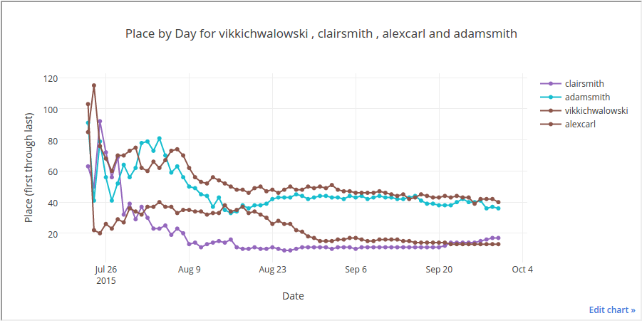
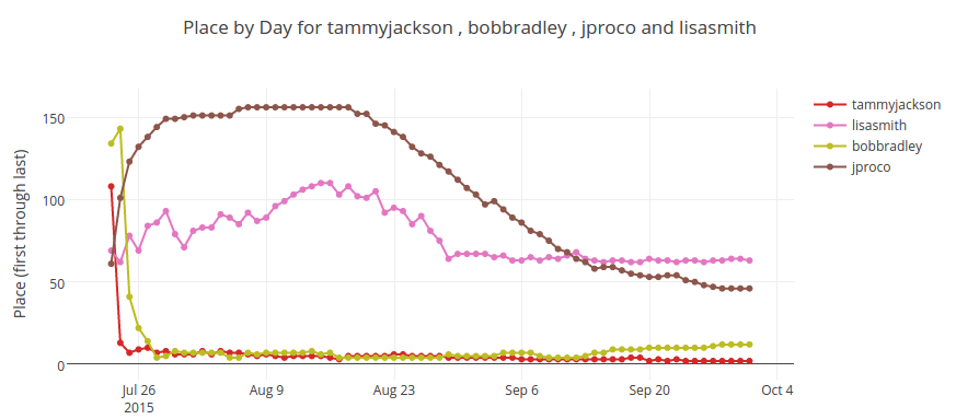
On these graphs, the most recent date is on the far right. Should we flip the axis or plot this from other perspectives? Do you see other games we can play with the data? Would anyone be interested in an API so they could hack similar plots themselves?